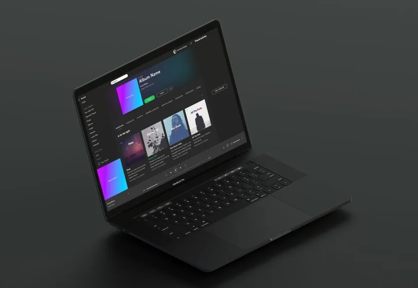
A regional retail chain came to Bilzit with a website that looked great on desktop but broke down on phones and tablets, where most of their traffic originated. We rebuilt the site from the ground up with a mobile-first, fully responsive layout across every page.
Challenge & Solution
Fixed-width layouts and oversized images meant slow load times and awkward navigation on smaller screens. We restructured the design system around flexible grids, scalable typography, and touch-friendly components.
Research
Concept Design
Implementation
Our Process
We audited every template for breakpoints that failed under 768px, rebuilt the component library with fluid spacing, and ran the site through real-device testing across dozens of screen sizes before launch.
Result Driven
Mobile bounce rate dropped noticeably within the first month, and page load times improved across the board, giving the client a site that performs consistently on any device.